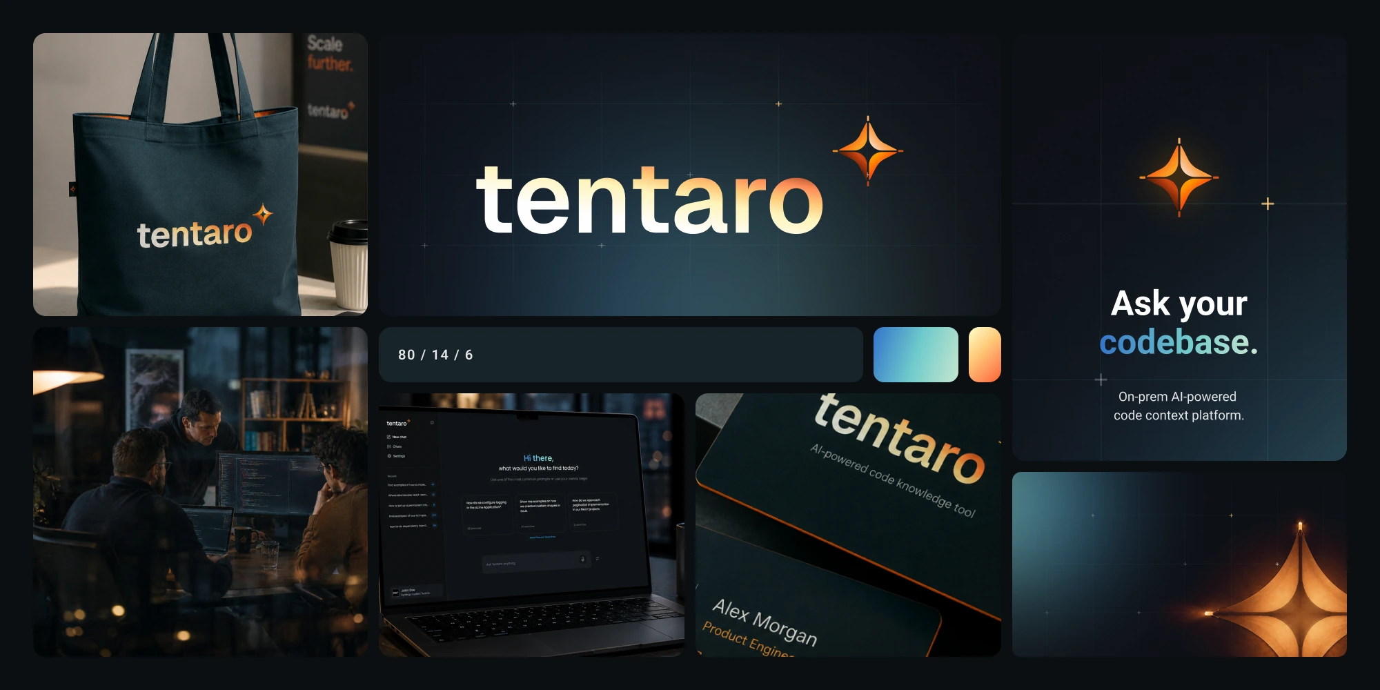
Tentaro brand collage: the wordmark on a deep teal ground, the colour proportion bar, a branded tote, the product on a laptop at night and the team working after dark

Tentaro: rebranding an AI tool for codebases

Client:

Tentaro

Scope

Brand strategy workshops, naming, visual identity system, logo and mark, color and typography tokens, key visual system, social and presentation templates, photography direction, diagram language, published Figma library, brand documentation, AI skills for creative production

Tools

Figma, Adobe Illustrator, Webflow, Claude Code

Tentaro is an AI tool that answers questions about a company's own codebase, on premise. It launched as CodeQA, where QA stood for Question and Answer. Almost nobody read it that way: developers saw QA and assumed a testing tool, so the name argued with the product in every conversation. The rebrand started there, as a fix for a misunderstanding rather than a refresh, and it became the first real brand the product ever had.

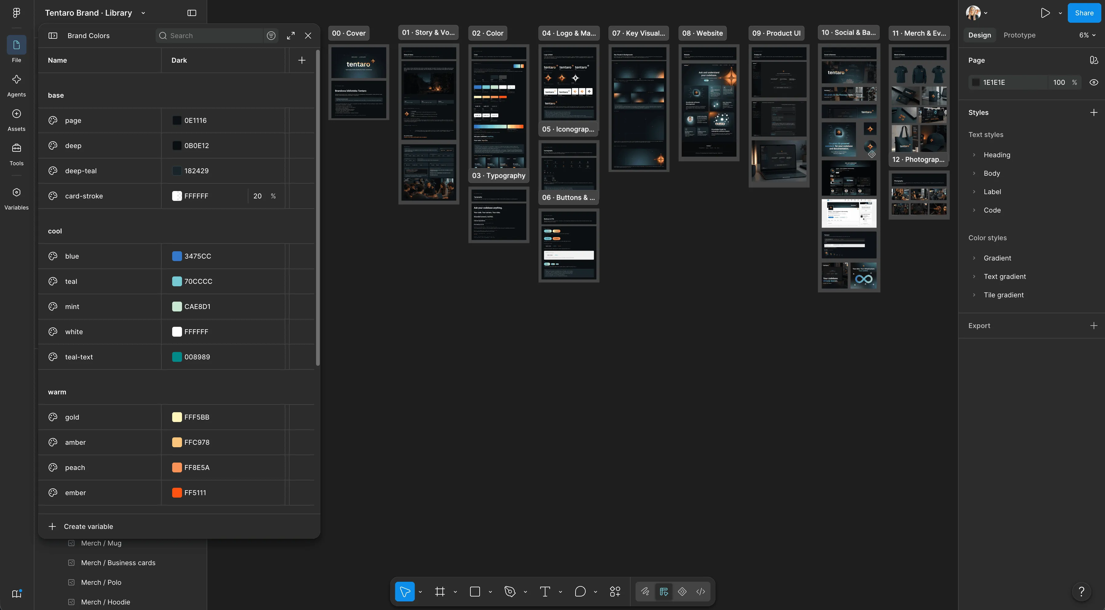
I ran the strategy workshops and consulted the results with the team, then designed the whole visual identity. The decisive move was shifting the axis from features to context: a team loses context when a key person leaves, and an AI assistant never had it. Context became the difference inside a category people already understand, which gave every later decision, from the name to the color proportion, something concrete to serve.
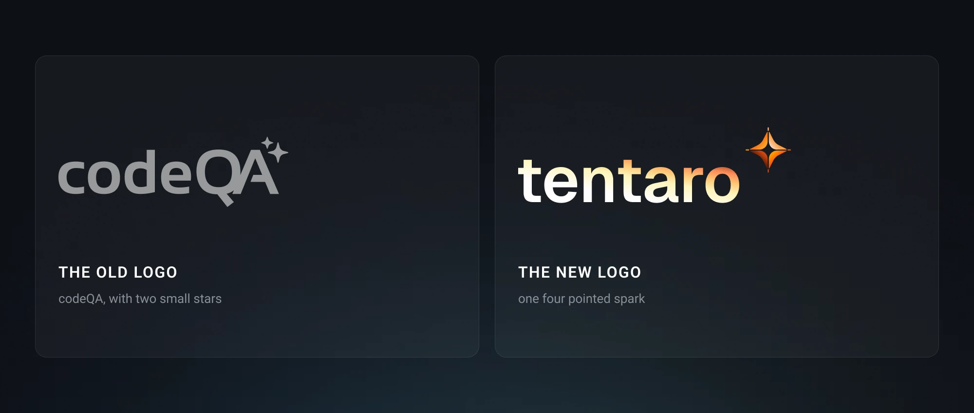
The old codeQA logo beside the new tentaro wordmark, labelled the old logo and the new logo

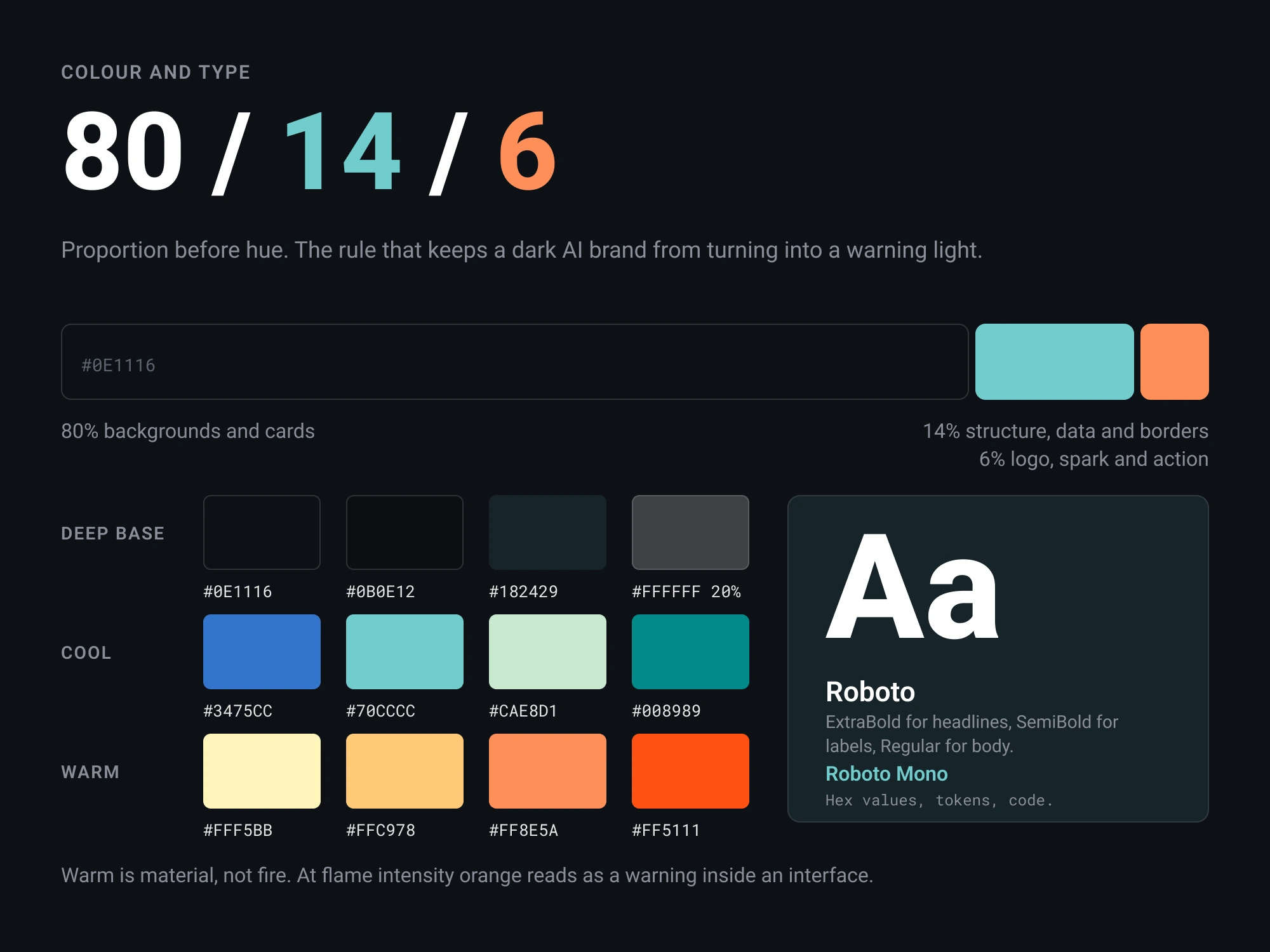
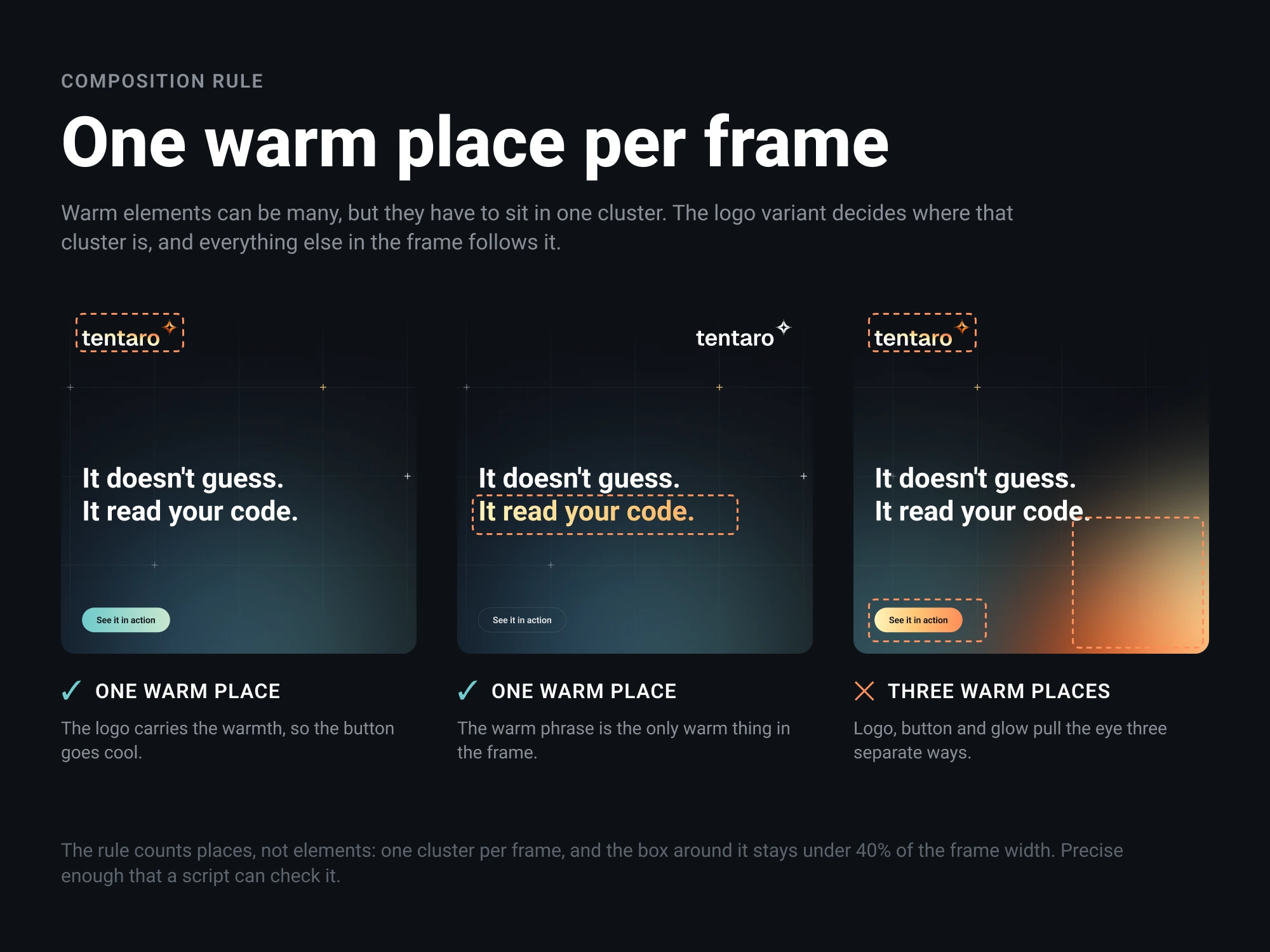
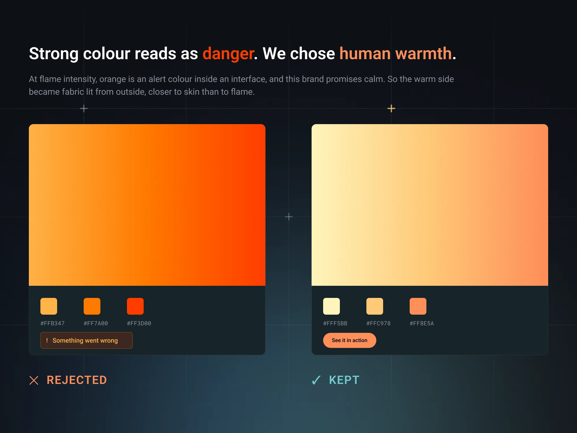
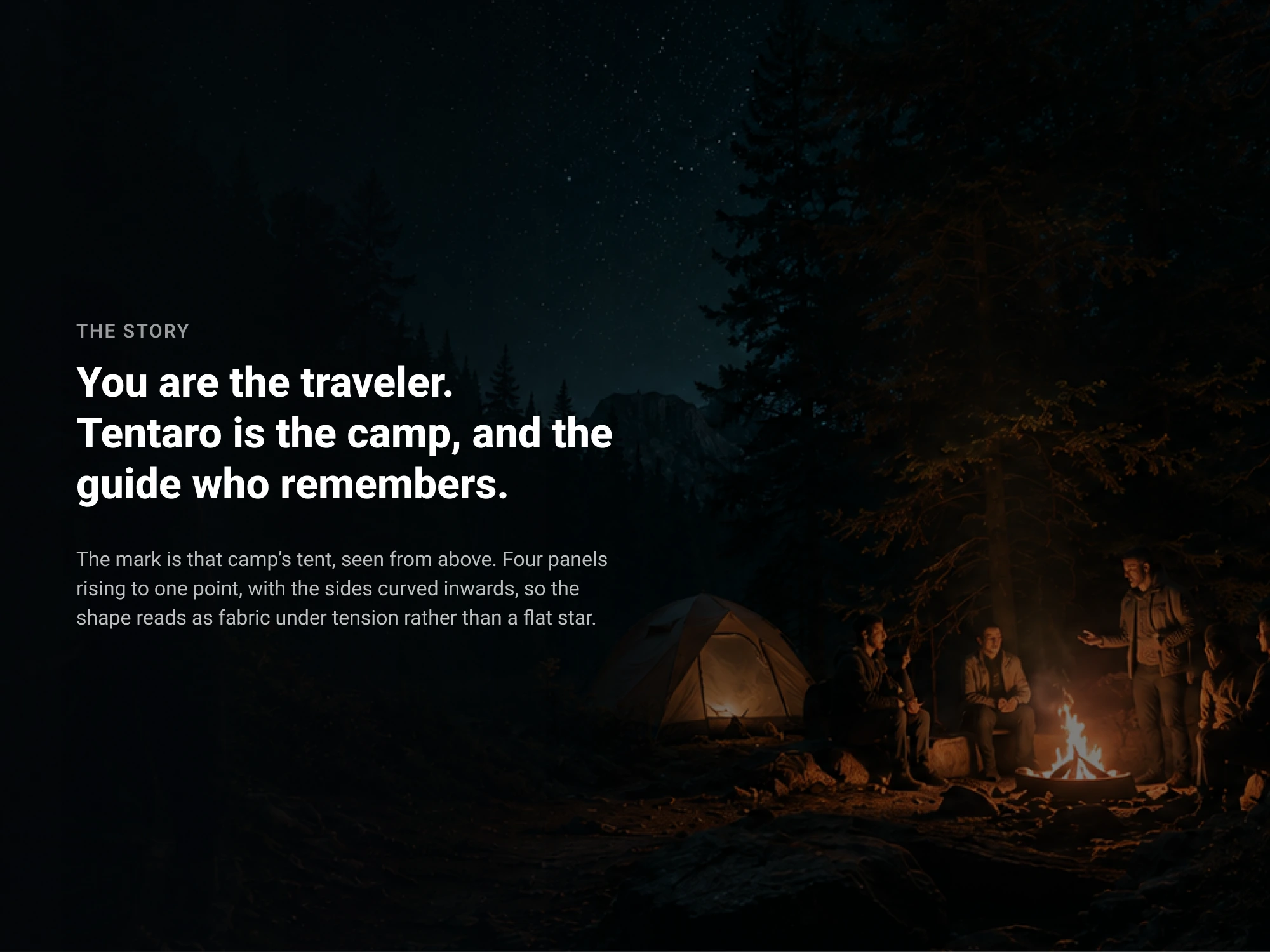
The identity is dark first and built on light. The mark reads as a tent seen from above and as the four pointed spark the AI category already uses, so it carries both a story of its own and instant recognition. The warm side stayed material rather than fire, because orange at flame intensity reads as a warning inside an interface. To stop that warmth from spreading, I wrote a composition rule that counts warm places instead of warm elements, defined precisely enough that a script can check it.

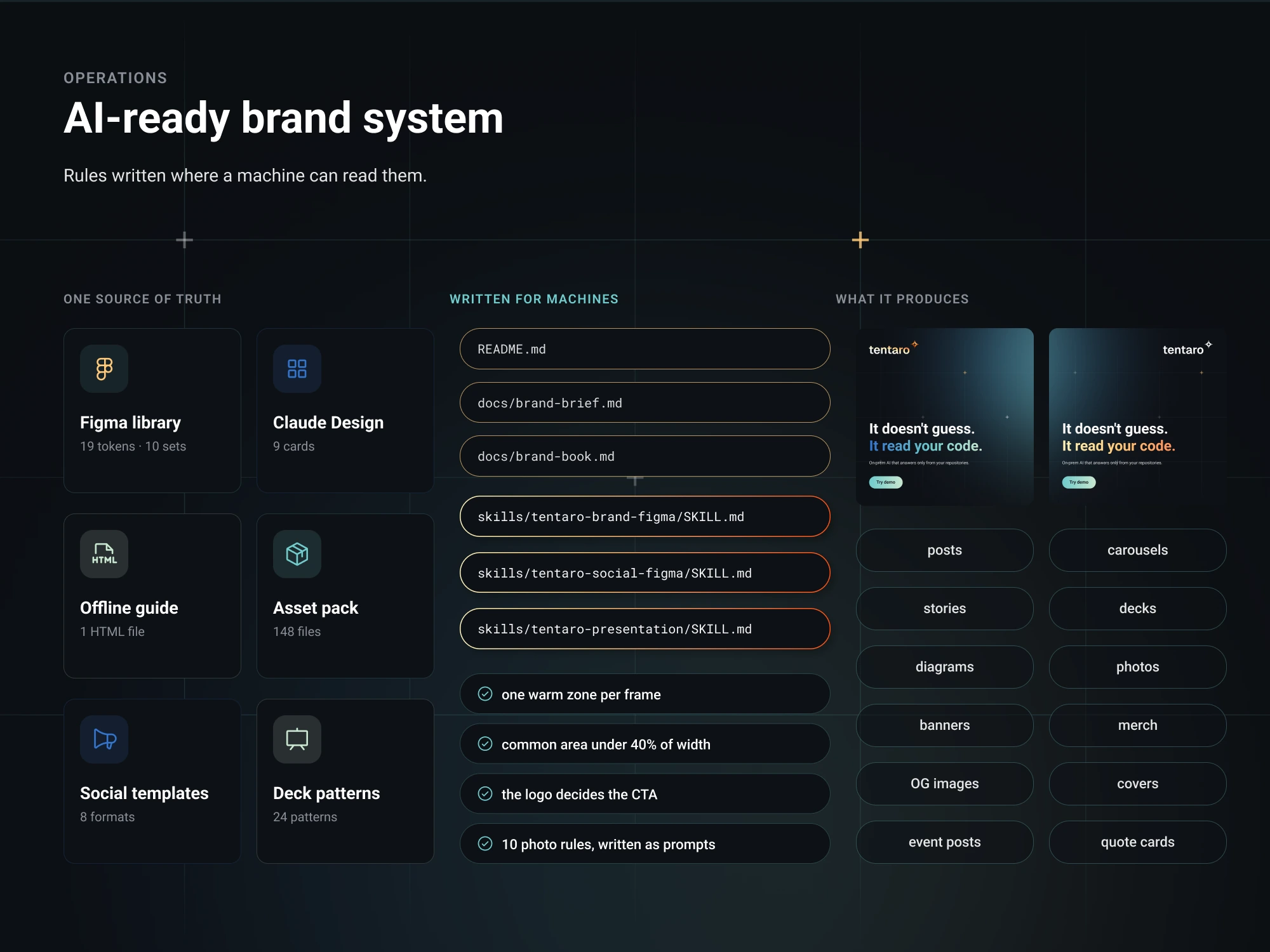
The deliverable was not a PDF. The brand ships as a published Figma library with tokens and component sets, templates for social, presentations and video, an asset pack, a self contained HTML guide that opens offline, and three AI skills that build new creatives from the real components. Marketing produces without me, and the brand it produces with is the actual one rather than an approximation of it.
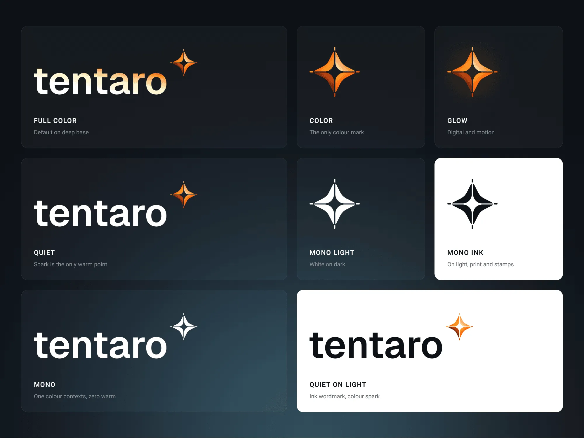
Logo and mark variants on dark and on light: full colour, quiet and mono lockups, and the mark in colour, glow and mono
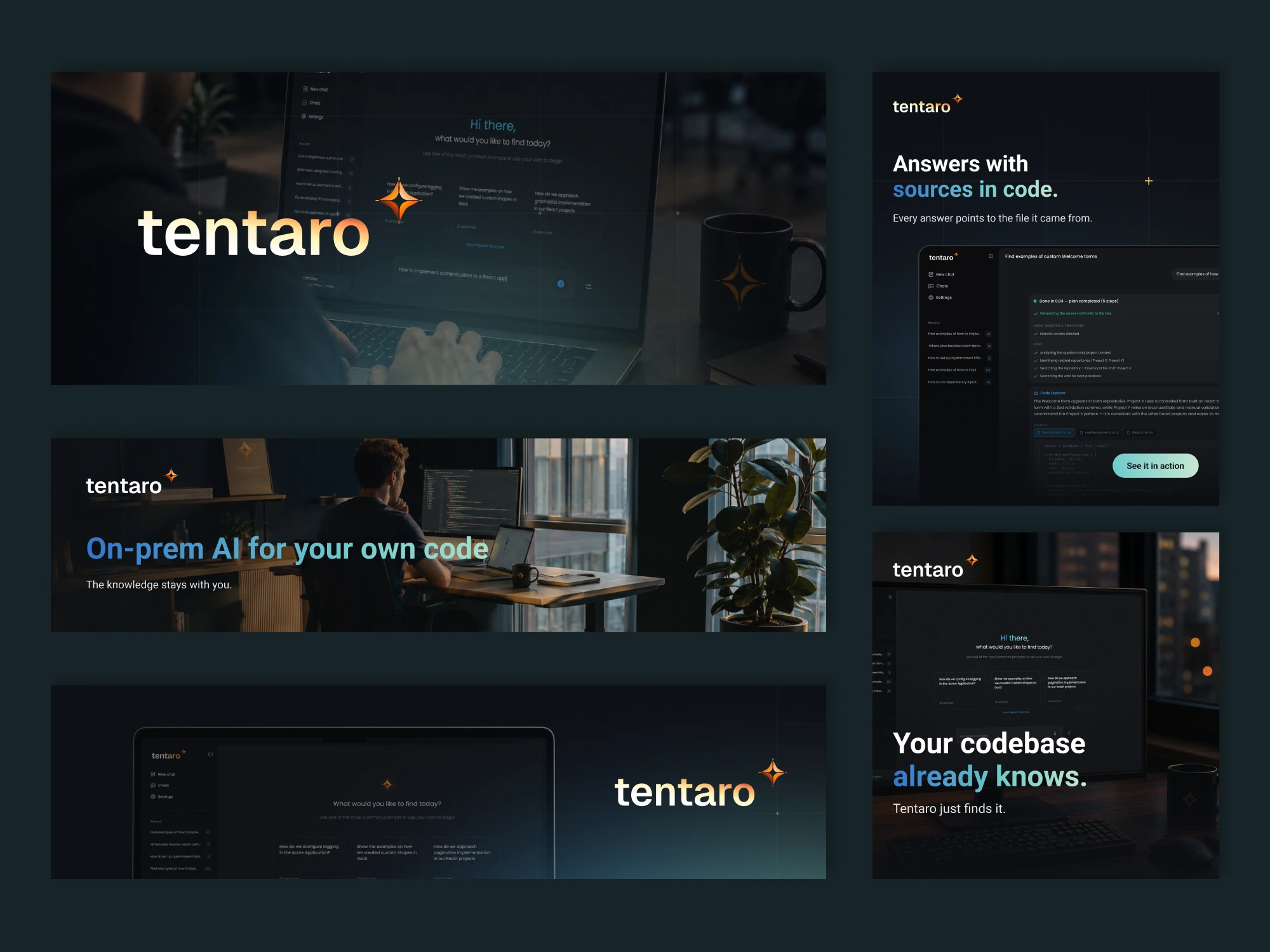
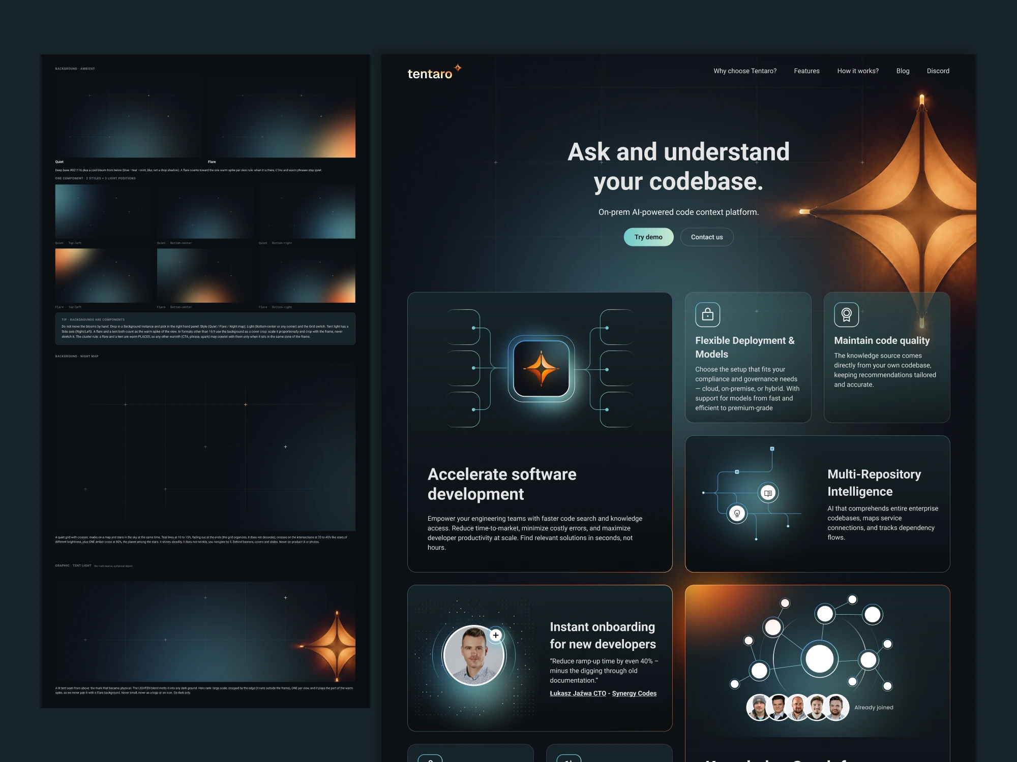
Operations board: tiles for the Figma library, Claude Design and the offline guide, a file list with three skill files, and the formats the system producesColour and type board: the 80/14/6 proportion bar, twelve colour tokens with hex codes grouped as deep base, cool and warm, and the Roboto type specimenSocial and campaign formats: LinkedIn covers, product posts and statement cards, each dark with a single warm accentBackground system: quiet and flare states lit from different directions, a starry night map grid, and the live Tentaro homepage
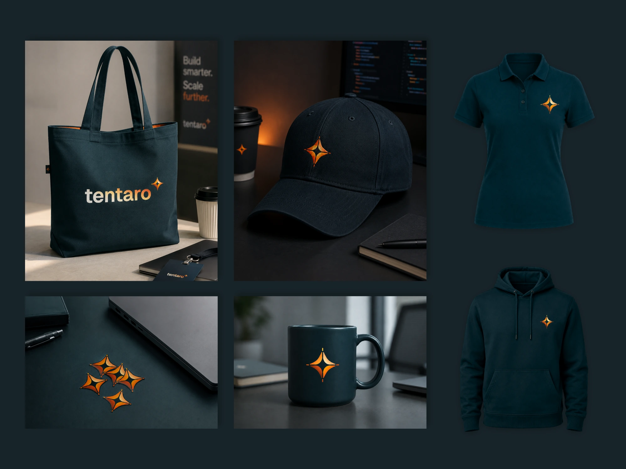
Merch in deep teal: tote bag, cap, polo and hoodie, a branded mug and a set of stickers, each carrying the amber mark
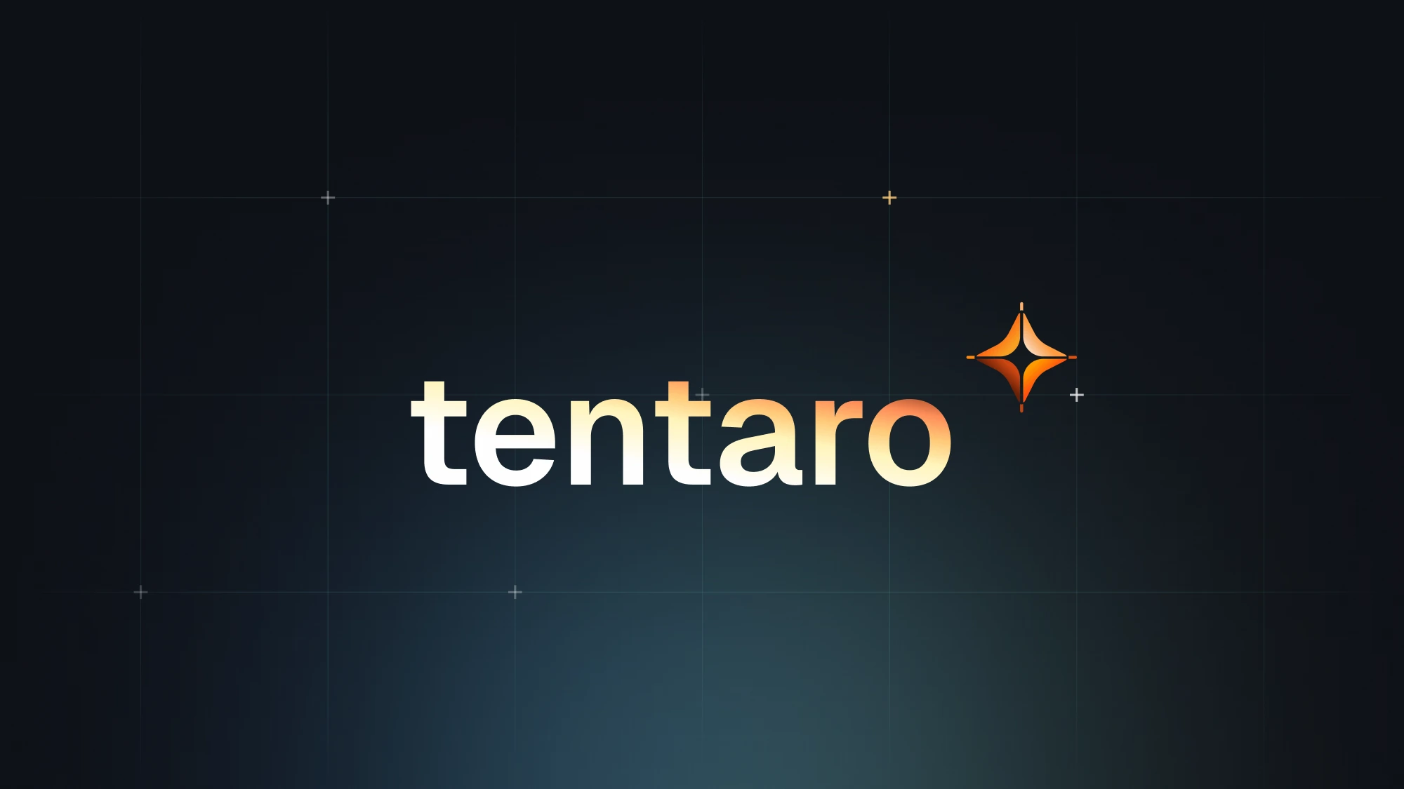
Closing card: the Tentaro wordmark in a warm gradient with its four pointed spark, on a dark night sky with a cool glow below
Three social posts annotated with dashed boxes: two with a single warm cluster marked correct, one with logo, button and glow marked as three warm placesTwo gradients side by side: the rejected fire orange with an error chip, and the kept warm gradient with a button, under the line that strong colour reads as dangerA lit camp and a tent in a dark forest at night, beside the line that Tentaro is the camp and the guide who remembersThe Tentaro Figma library open on the canvas, with the colour variables panel showing the base, cool and warm tokens