Opal & Prism Brand Concept
Client:
Scope
Tools
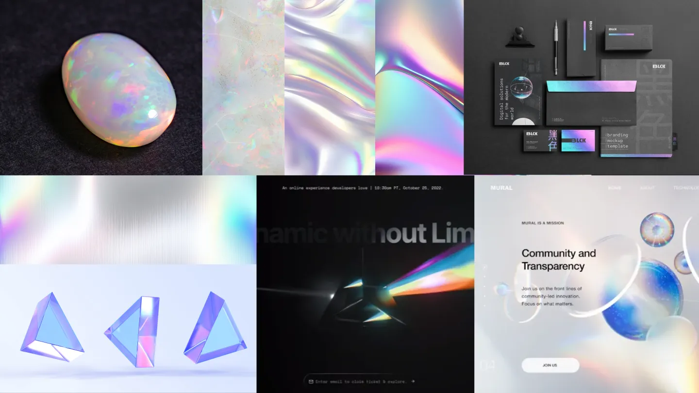
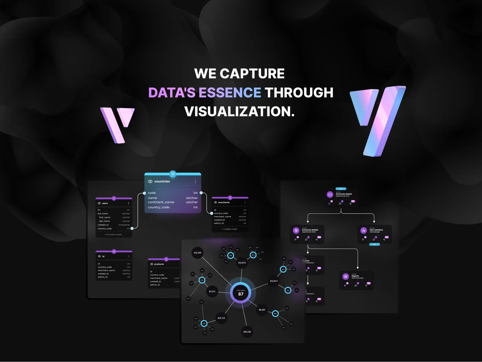
This project explored a new brand direction for Synergy Codes built on the contrast between minimal, matte black surfaces and iridescent opal-like light. The concept translates the company’s expertise in data visualization and advanced software into a tactile visual language, where austere materials such as concrete, black paper, and shadowed environments are intersected by prismatic gradients and holographic reflections. The resulting aesthetic positions the brand at the intersection of engineering precision and digital immateriality.
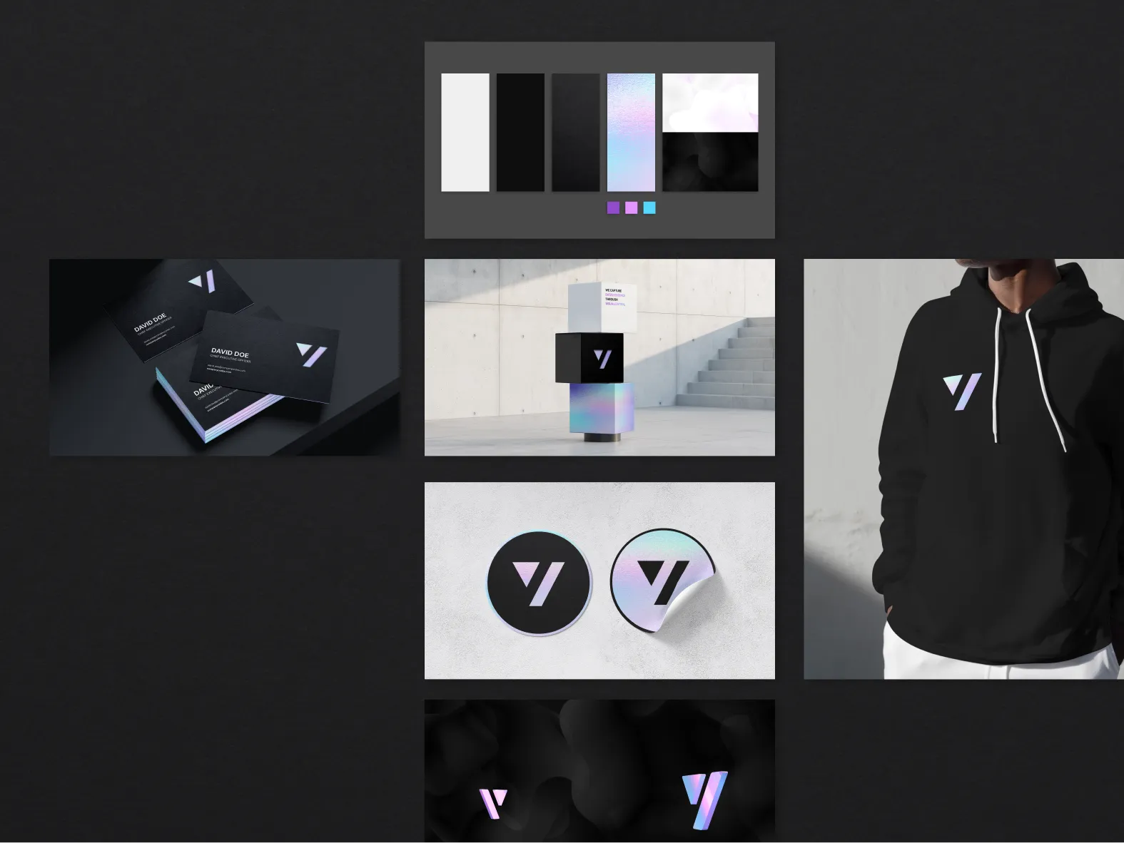
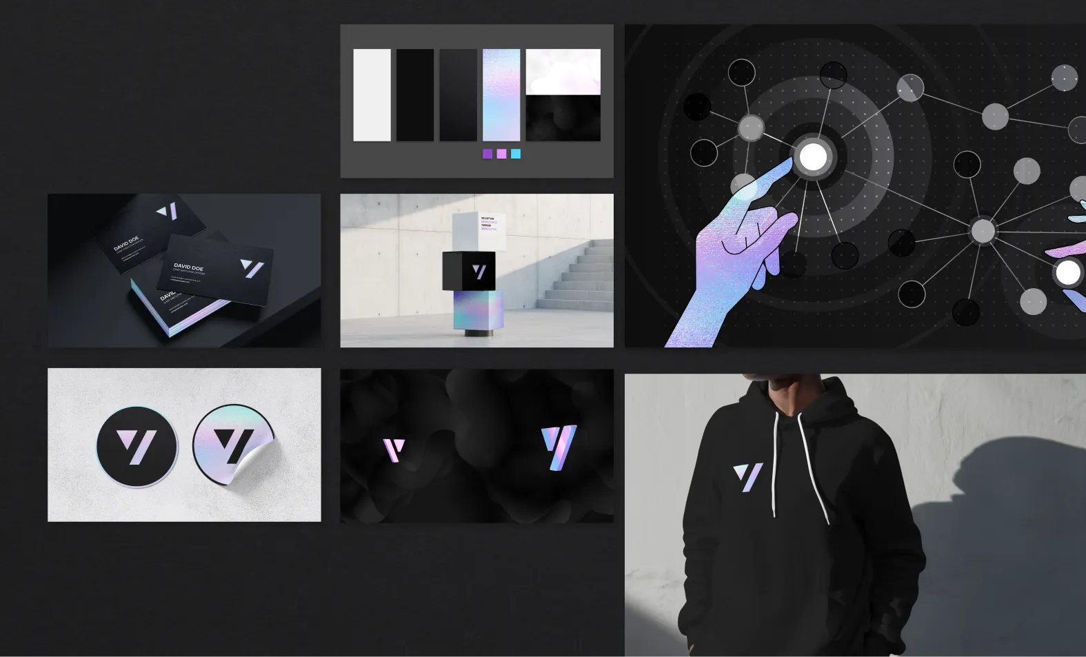
A refined visual identity system was developed around this material contrast, including logo applications, color behavior, and surface treatments. The iridescent spectrum functions as a metaphor for data transformation and visualization — light emerging from darkness — while the restrained black foundation maintains technical credibility and minimalism. This balance enables the brand to feel both premium and technologically grounded.
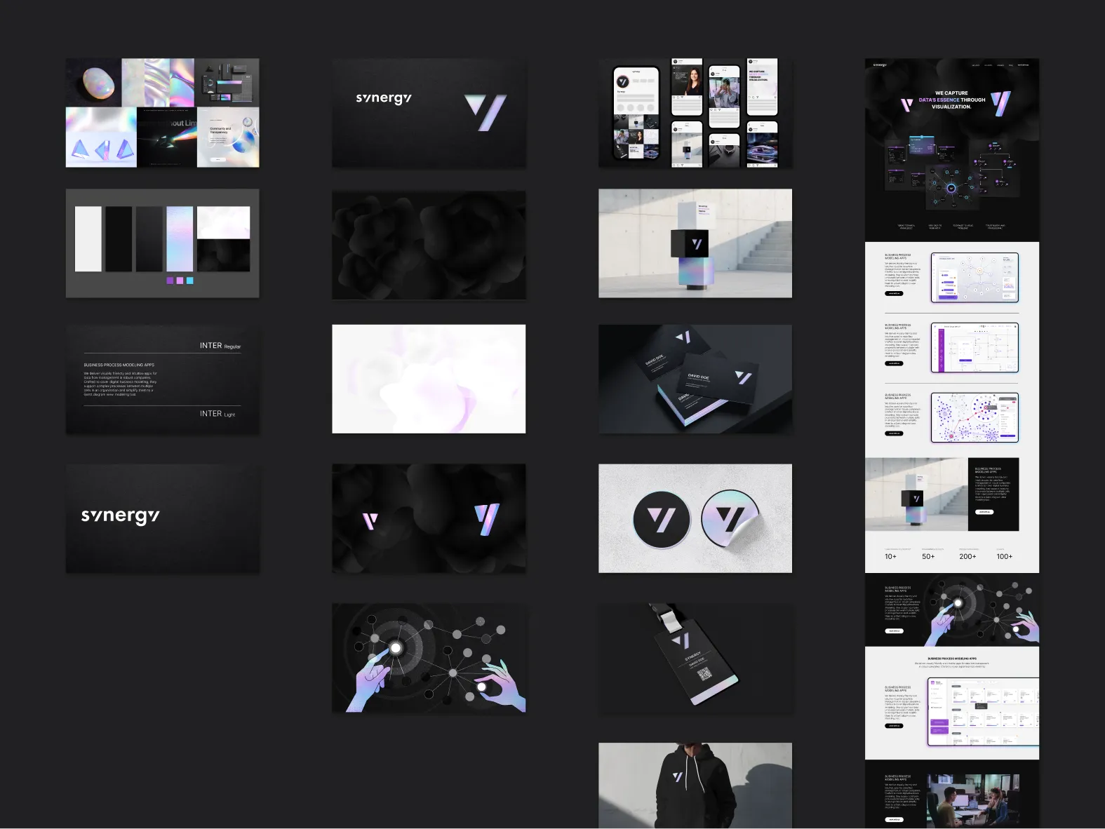
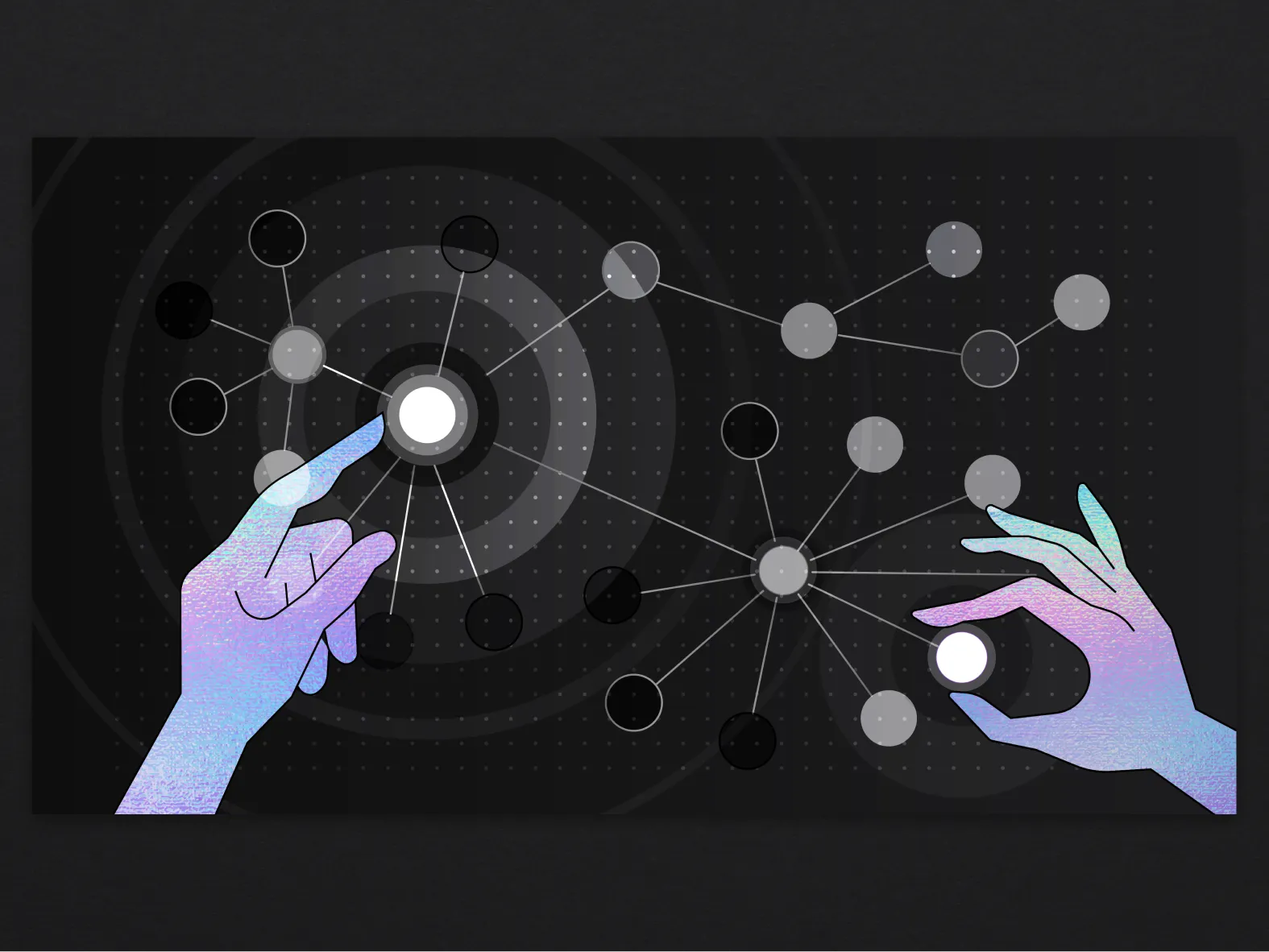
The concept extended into brand imagery and illustration, combining geometric visualization structures with human interaction motifs rendered in subtle spectral tones. These elements reinforce themes of connection, perception, and data flow while maintaining a cohesive visual rhythm across digital and physical contexts.
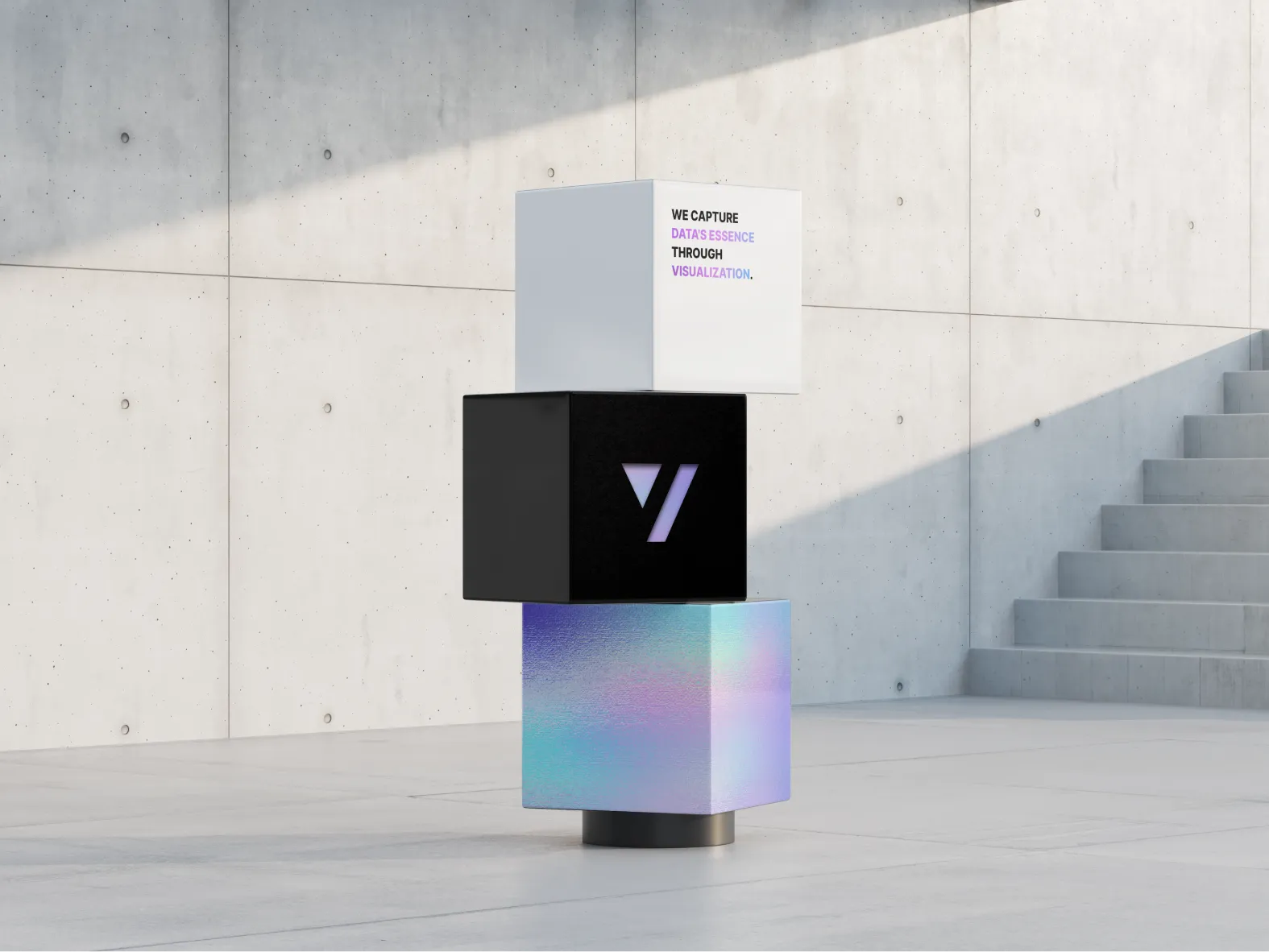
Applications were explored across print, environmental, and digital touchpoints, including stationery, merchandise, spatial mockups, and web hero visuals. The result is a distinctive brand direction that expresses Synergy Codes’ focus on complex data systems through a contemporary material and light-based visual language.